Lifetime
Lifetime
Brand Identity, Animation, User Interface
Brand Identity, Animation, User Interface
Brand Identity, Animation,
User Interface
Brief
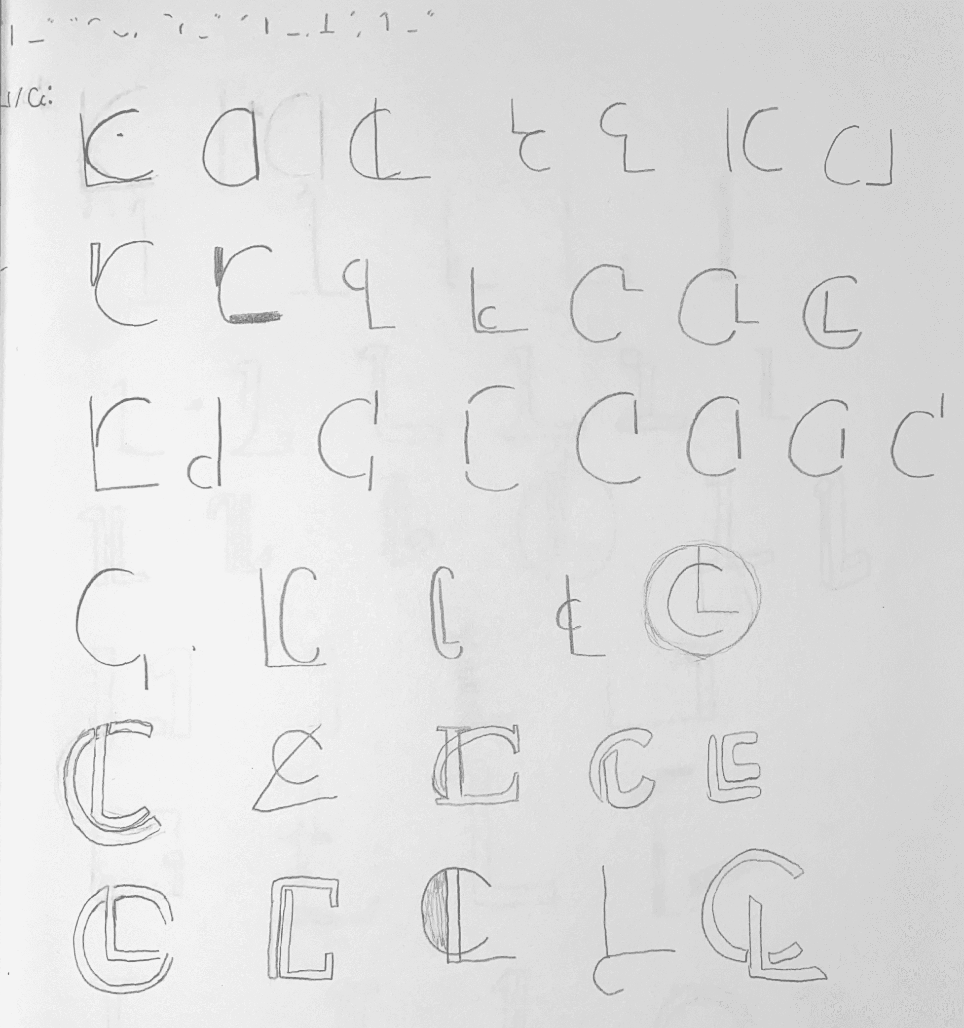
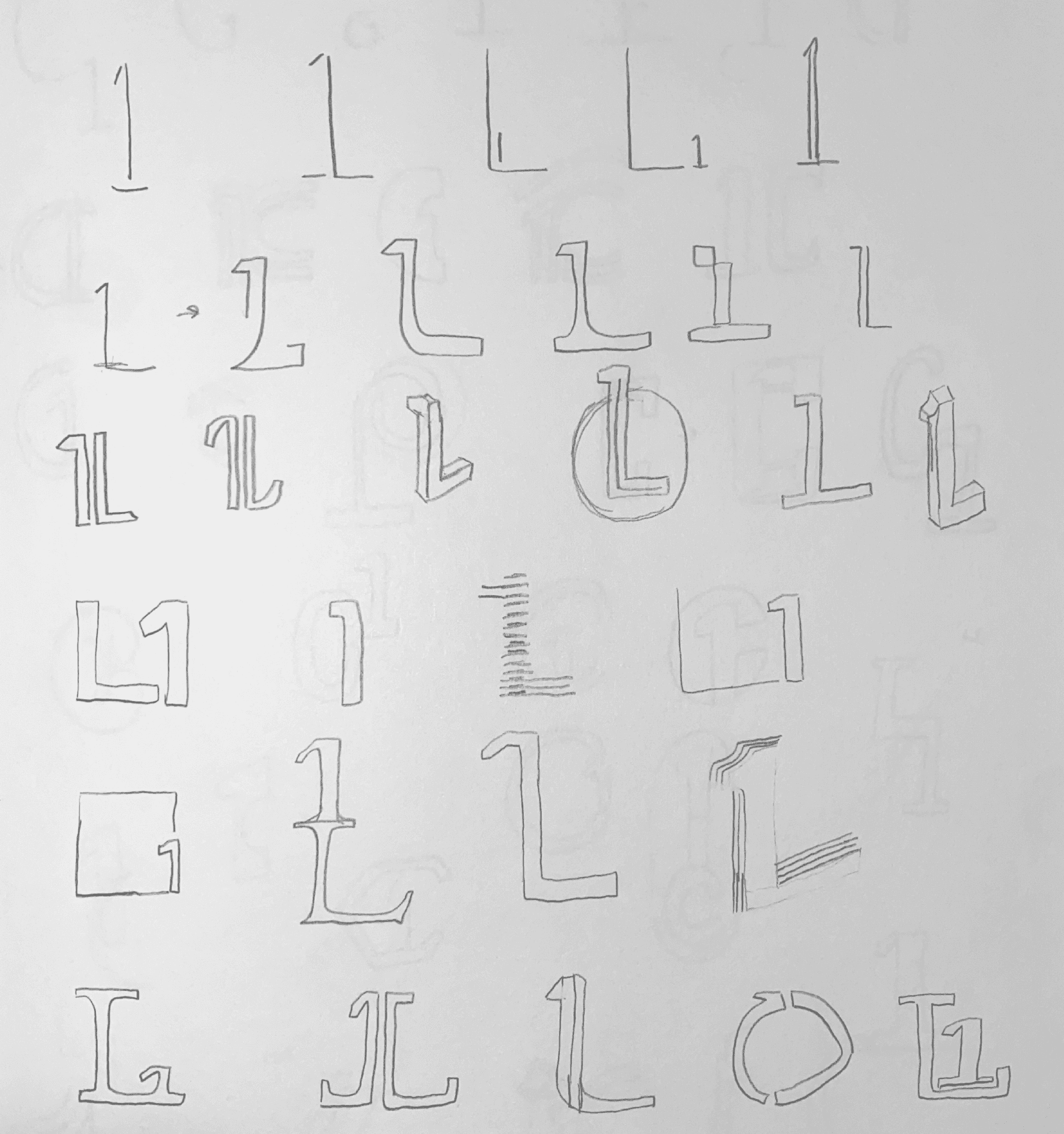
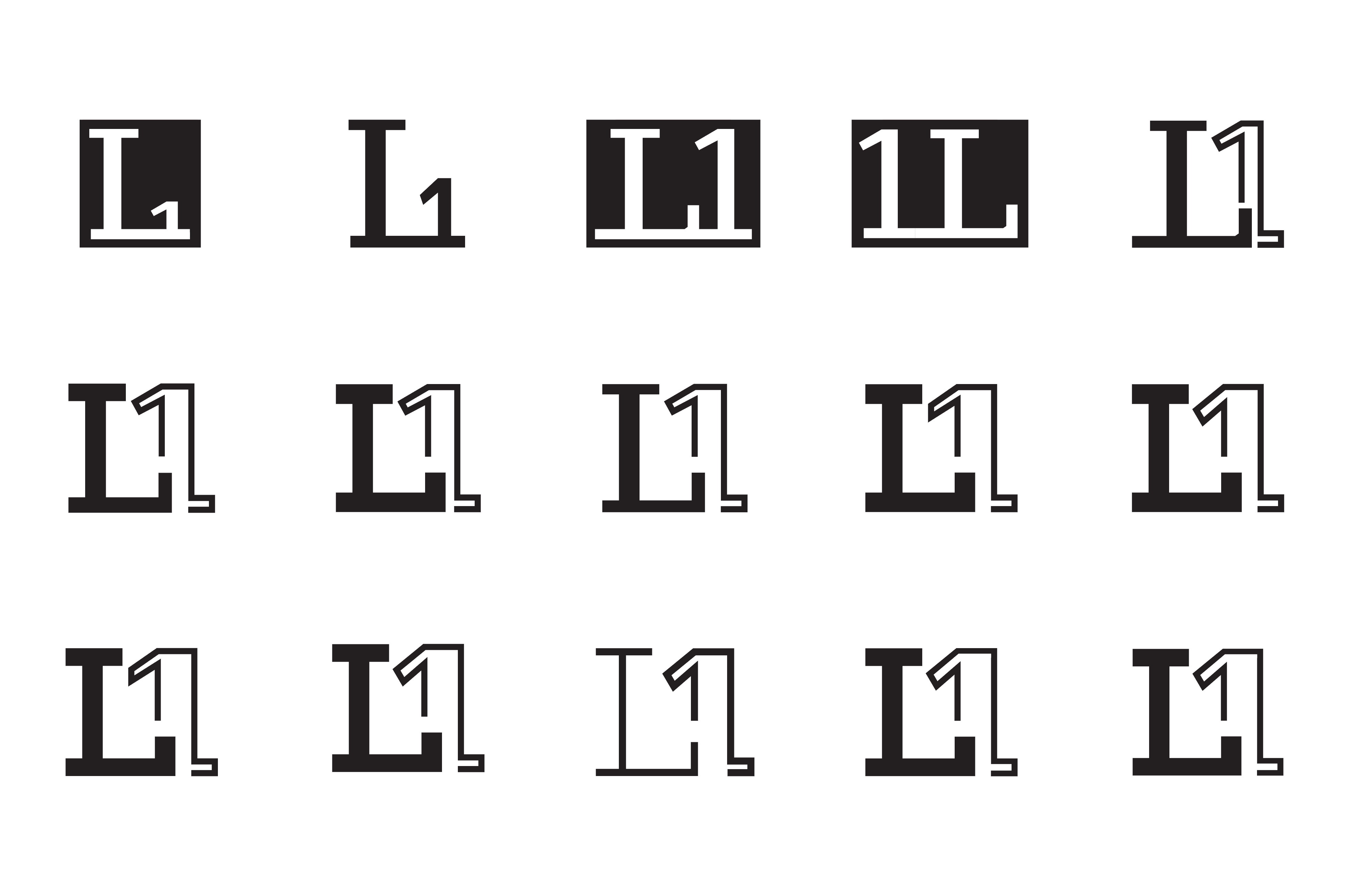
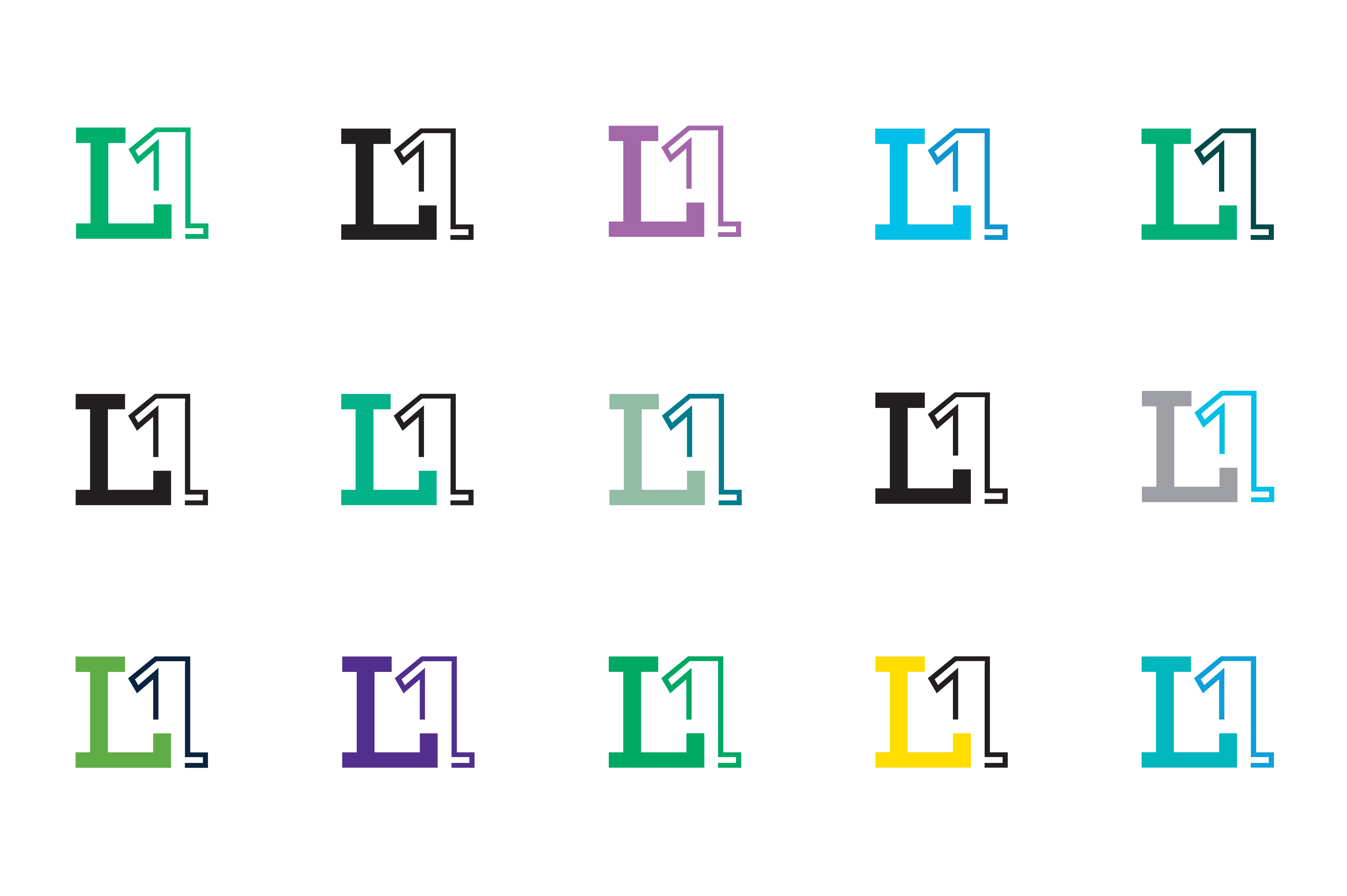
The LetterNumber project is centered around the exploration of form. The primary objective being to develop an innovative symbol by combining existing letters or numbers into a cohesive and functional design.
The process requires deconstructing letterforms, identifying structural commonalities, and experimenting with combinations to create a compelling mark. Once the symbol is designed, a fictitious company name will be selected to align with the industry norms and the visual character of the symbol.
Brief
The LetterNumber project is centered around the exploration of form. The primary objective being to develop an innovative symbol by combining existing letters or numbers into a cohesive and functional design.
The process requires deconstructing letterforms, identifying structural commonalities, and experimenting with combinations to create a compelling mark. Once the symbol is designed, a fictitious company name will be selected to align with the industry norms and the visual character of the symbol.
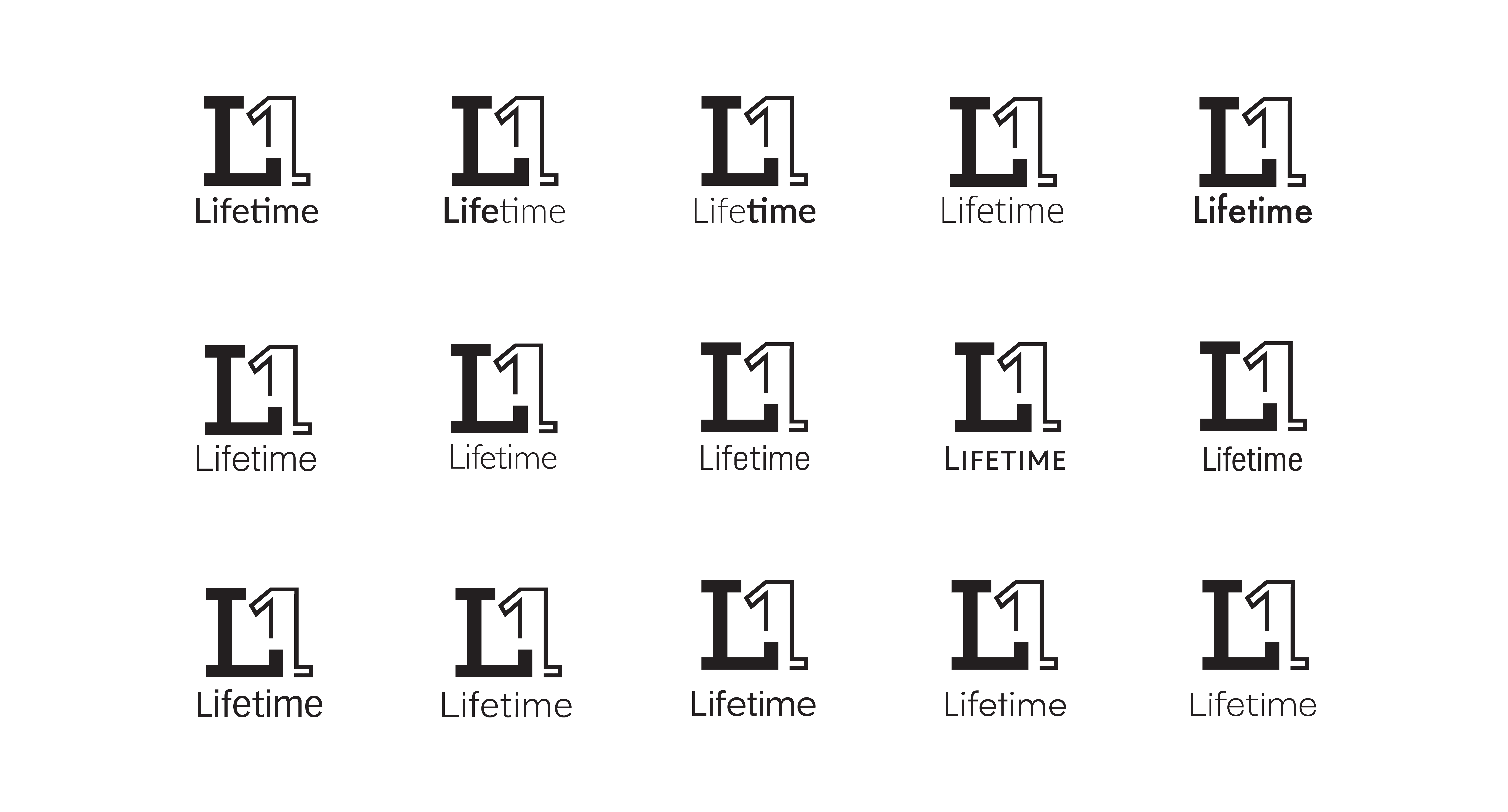
Solution
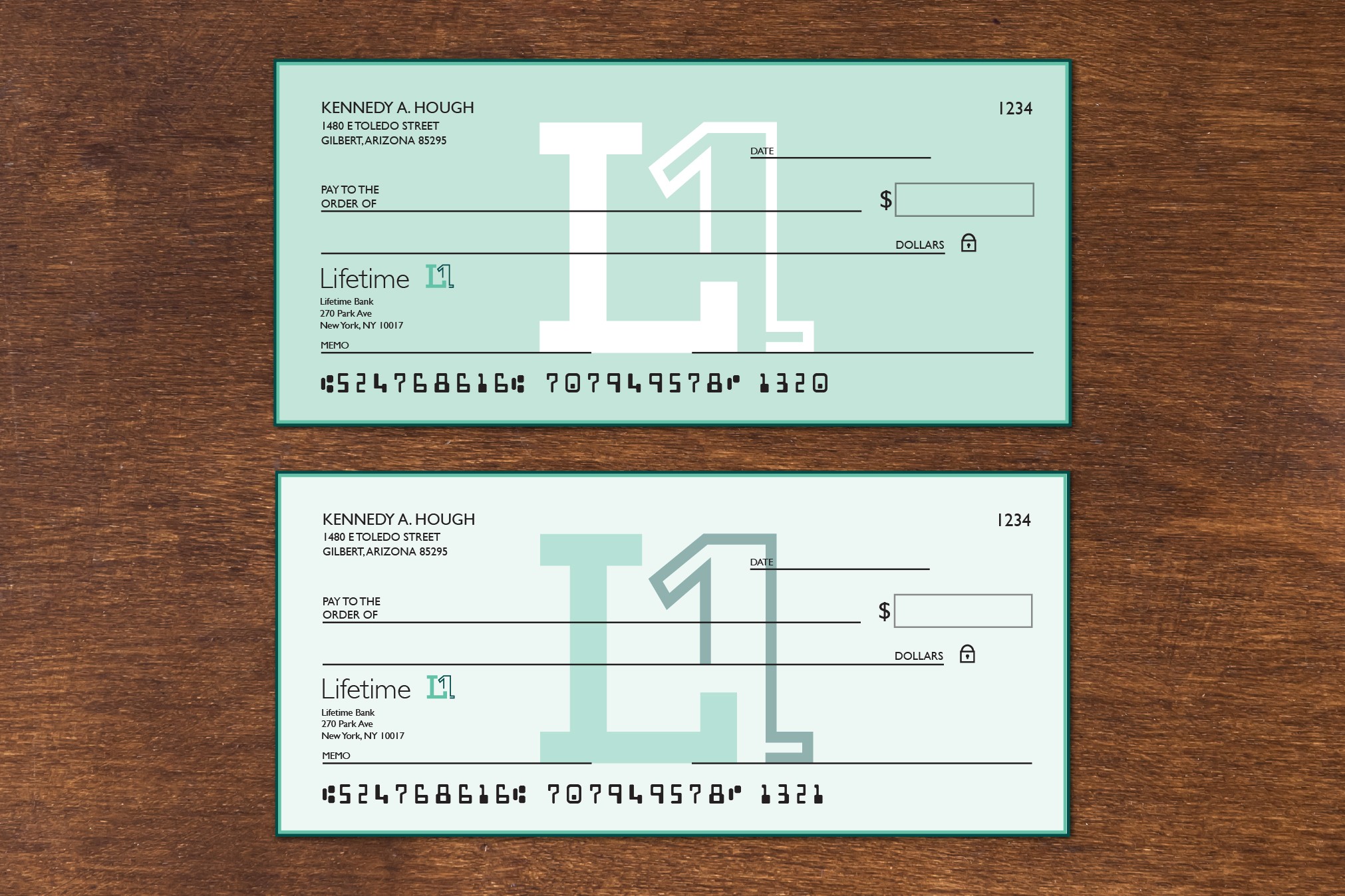
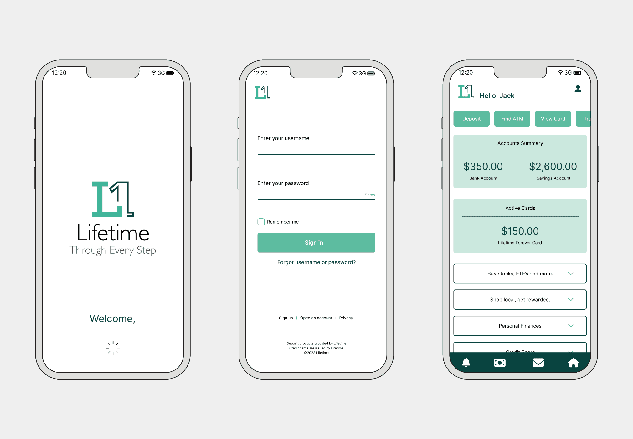
By designing a strong logomark and thoughtful visual elements, I approached Lifetime with the idea of creating a trustworthy yet approachable bank identity. While finances are serious, it’s important to acknowledge that managing them should not be a source of stress.
The visual identity of Lifetime centers on trust, support, and friendliness. Their tagline, "Through Every Step," emphasizes their commitment to providing continuous support throughout their customers’ lives and every situation.
Solution
By designing a strong logomark and thoughtful visual elements, I approached Lifetime with the idea of creating a trustworthy yet approachable bank identity. While finances are serious, it’s important to acknowledge that managing them should not be a source of stress.
The visual identity of Lifetime centers on trust, support, and friendliness. Their tagline, "Through Every Step," emphasizes their commitment to providing continuous support throughout their customers’ lives and every situation.


Process